Background
For my Springboard program’s Capstone 2 project, I was tasked with assisting a fictional media company in converting their base of free users to a premium, paid plan.
There was a given set of detailed personas, and their average user was 18 - 24 years old, tech-savvy, regularly on their phone for hours per day, budget-conscious, and cared deeply for music, movies, and books.
Research
Similar companies that have had success with converting free users into paying ones include YouTube, Spotify, and Pandora. I analyzed these three companies from the perspective of a free user that is considering whether or not to upgrade and made notes on my likes and dislikes of their process and design.
I then determined the name, color palette, and typography for this fictional media company whose brand attributes are ‘bold, hip, and smart’. I chose the name ‘Vibe’ as I felt this embodied the attitude of the brand. I also selected bold colors like yellow and black, and a straightforward font called ‘Rubik’. Next, I created a project plan in order to stay on track which included dates, methodologies, and a rationale for the chosen mode of research/testing/etc.
Discover
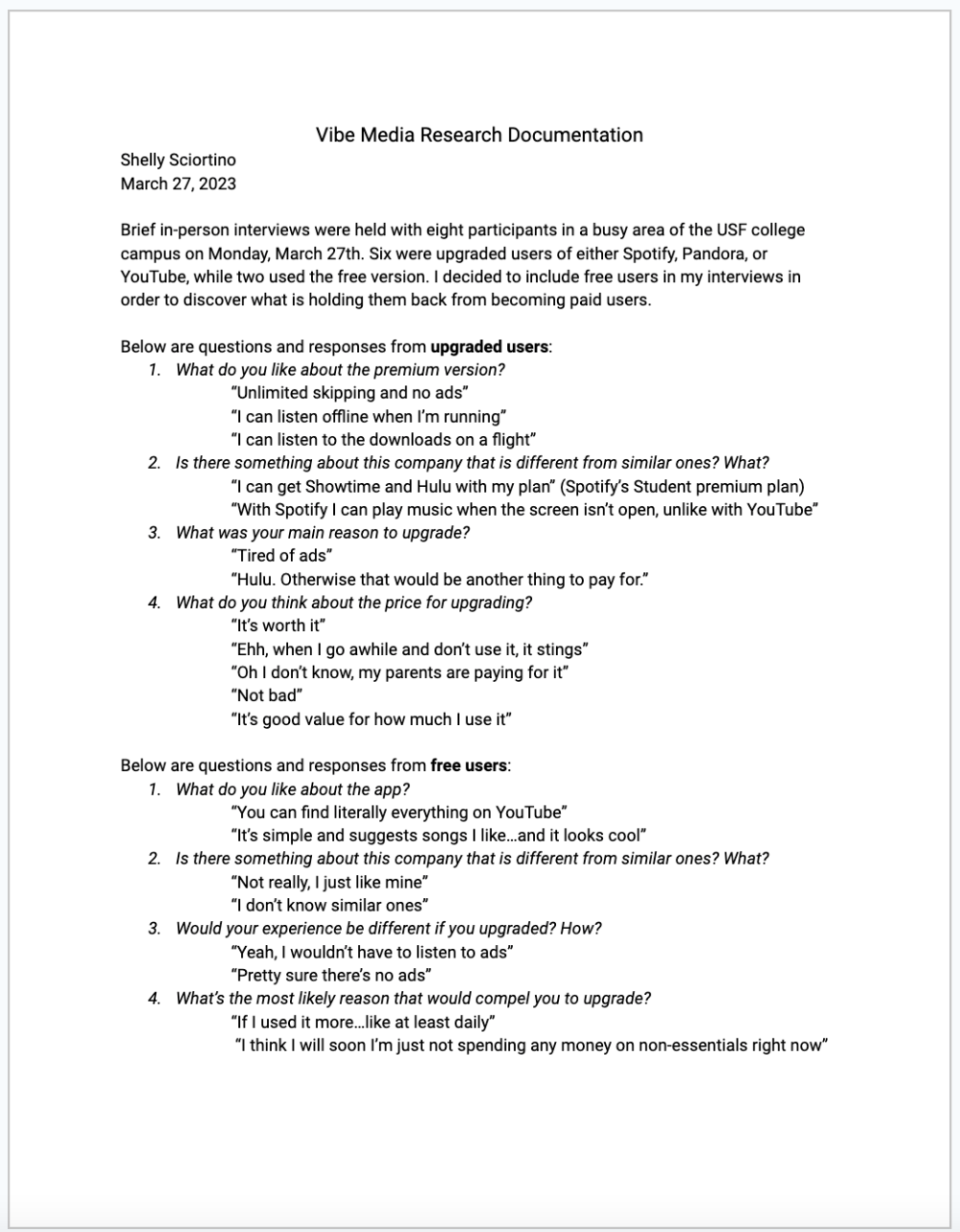
My first Discover phase began with a research plan in order to successfully conduct my guerilla usability testing. I then documented the results of my testing with the script and exact answers received. The research was synthesized with an affinity map to provide insight into the user’s motivation to upgrade, reasons some haven’t upgraded, and which aspects of the premium versions they find most exciting or useful.
Design
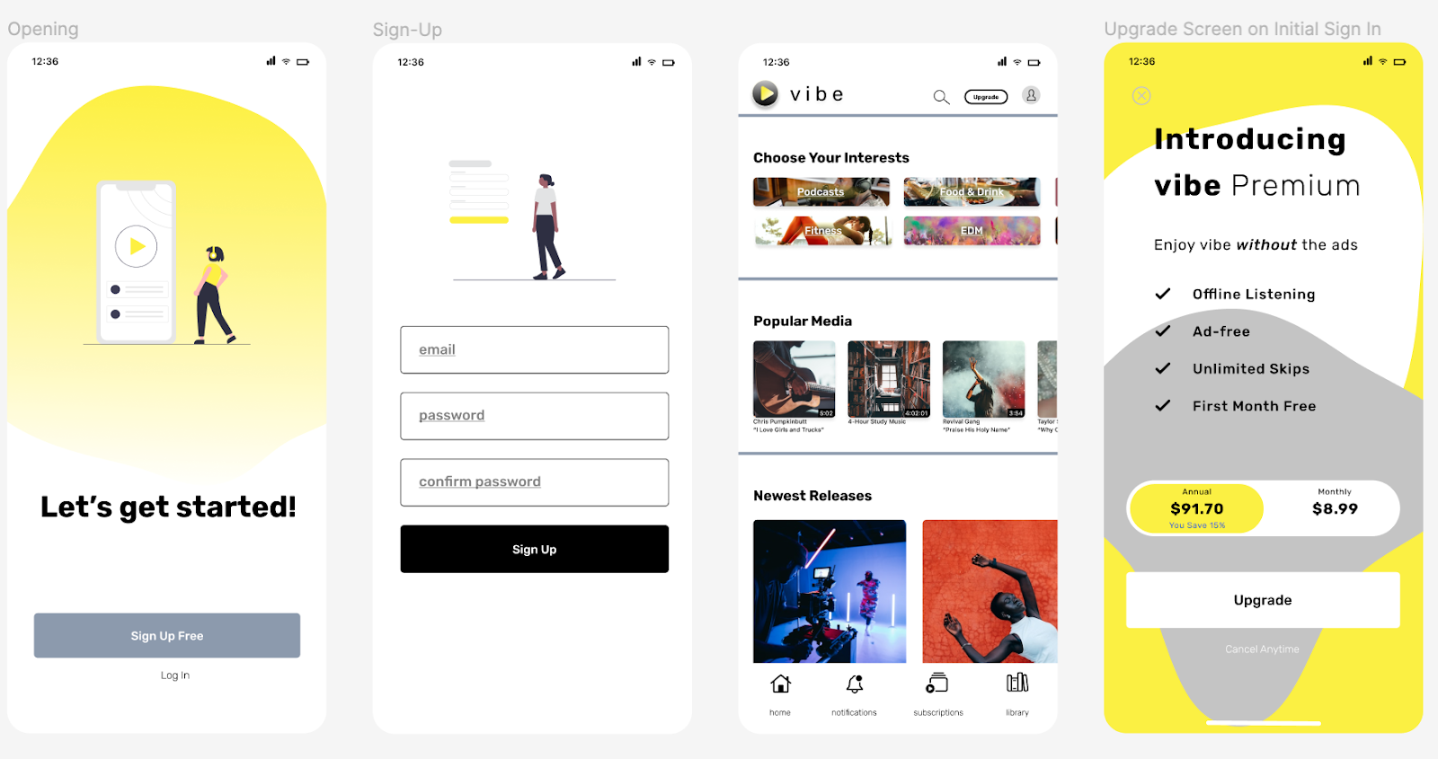
After reviewing the research, my next step was to design user flows for both new and return users. The goal was to provide opportunities to upgrade. I modified the given low-fidelity wireframes in order to include these opportunities.
Validate
Next, I conducted four in-person interviews with individuals that fit the app’s target demographics. Instructions were given to complete common tasks including upgrading their subscription. They were able to complete the assigned tasks easily. Useful feedback included the lack of a visible app title and a desire for a subscription button to be added to the home page for easy accessibility.
Design
Taking feedback from the usability testing, I made some changes and created the first round of high-fidelity prototypes.
Validate
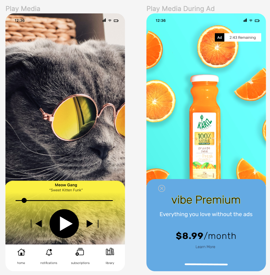
Next, I conducted four in-person interviews with individuals that fit the app’s target demographics. Instructions were given to complete common tasks including upgrading their subscription, which were easily completed. Useful feedback included small design inconsistencies and the advertisement page not standing out as an ad.
Deliver
Taking feedback from my second usability testing, I enhanced the ‘vibe’ logo, defined spaces more prominently, refined the ad page, centered applicable areas, and adjusted the song title and artist name on the play media page.


